A great deal of creative effort went into adapting the new look across platforms, creating templates and visuals, and launching a nationwide billboard campaign. This effort aimed to establish the new brand identity through multiple elements and diverse channels.
The Basics of a Brand Identity
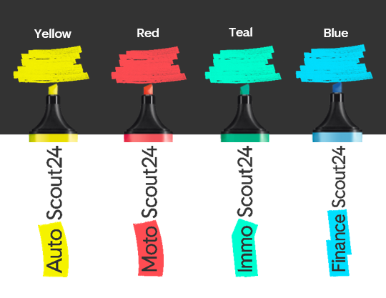
Up until June 30th, you could only distinguish the Scout24 brands and their brand identity by their names since their logos did not show any platform-specific differences. An essential aspect of this rebranding’s visual and strategic development was ensuring each platform’s distinctiveness.
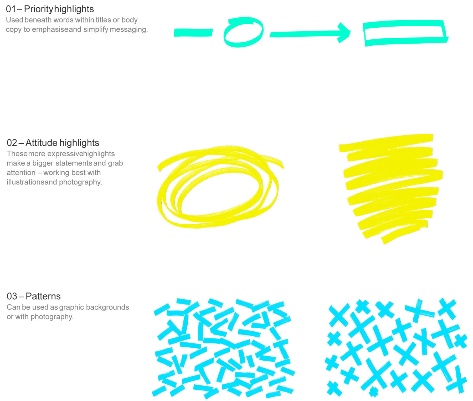
The bold and bright colour palette is inspired by the vibrancy of traditional highlighters. The branding team allocated a different highlight colour from this core palette to each marketplace.
An array of different design elements in the designated colour allows the brands to highlight (literally) their core values. The highlighters, distinctive graphic elements, are versatile across brand communications, distinguishing campaigns and visuals, even independently from the logo. They enhance the brand identity, providing recognizability and coherence throughout various materials and contexts.
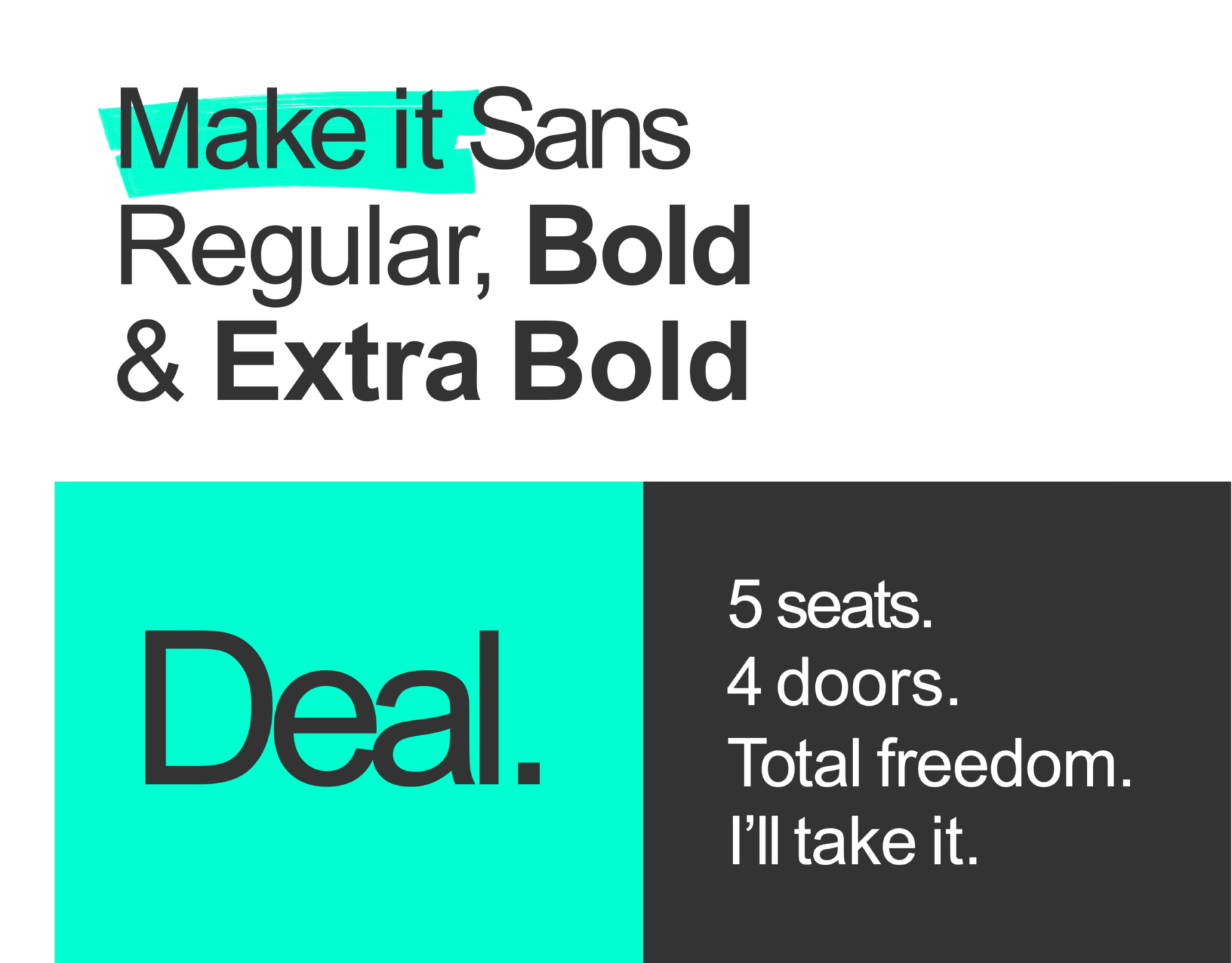
Last but certainly not least is the typeface. « Make it Sans » suits all Scout24 brands, featuring cuts, angles, and strokes inspired by the word mark and brand language. These elements subtly tie the typeface to the overall brand design, ensuring a cohesive visual language.
Think "Global", Act "Local": Brand Identity Elements
Adapting the brand image to the local market is crucial for Scout24’s success, despite its global brand licensing approach.
Francesco Corbino, Scout24 Brand Management Team Lead at SMG, encountered project aspects suitable for local branding, requiring initial development. Creative assets like illustrations, tone of voice, and sound logos were crafted to resonate with the Swiss market and differentiate from international competitors.
Illustrations
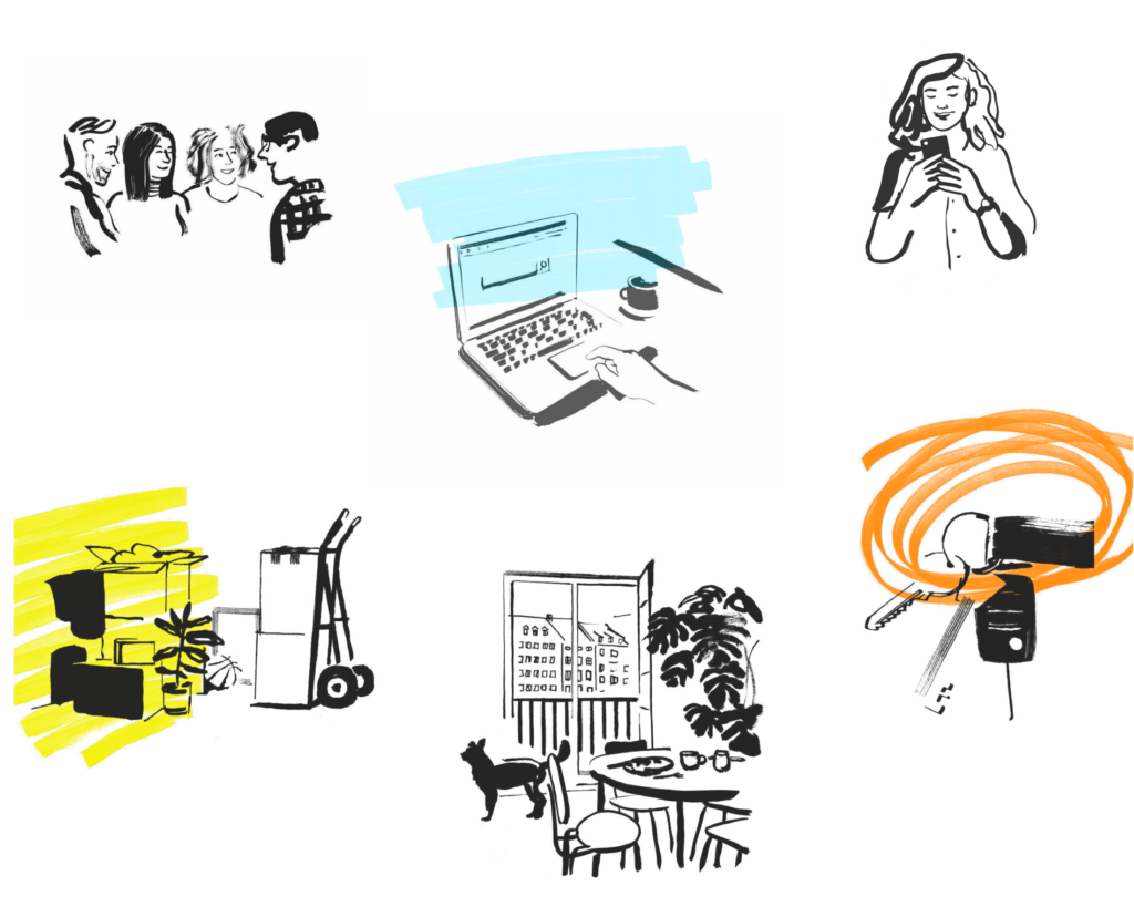
One way of making a brand come to life is through illustrations. They infuse visuals with emotion surpassing icons and offer versatility over photography, given exchangeable color palettes and superimposition capabilities. A set of illustrations was made available to everyone for the launch of the rebranding by Pol Montserrat. Illustrations can be generated for different needs, which allows the platforms to create tailor-made campaign visuals for local communications.
Photography
Real moments look very different from region to region. With this in mind, our Scout24 brands want to show authentic people and their lifestyles. It’s key to show people or families in their natural environments. Whether that’s a couple moving into their new home or someone driving their first car, it’s important to show a breadth of people and a variety of lives. These images have to correspond with what a diverse life in Switzerland could look like, making sure that architectural styles, street signs, and other regional distinguishing features are represented.
Tone of Voice
One peculiarity of the German language – versus English – is the different degrees of formality when addressing customers or clients. Whilst the tone of voice for users of the platforms should remain engaging and personal, thus using the informal “du”, addressing B2B clients should still come with a certain degree of formality, using “Sie”. Our product teams are currently adapting this on all platforms. This seemingly small change makes a huge impact on how a user or a customer feels when interacting with our brands. Our platforms are built to make the users’ lives easier and make their goals happen. A more personal approach to the tone of voice and language is crucial for a user to feel more comfortable, engaged, and empowered by the platform.
Make it happen? We did!
There is a lot of thought and hard work that goes into creating new branding. Many different aspects have to be respected and adapted, keeping in mind not only the users and customers but also the teams who work with the different visual assets and platforms on a daily basis. A successful brand has to have a recognisable character that can be implemented and understood without long explanations: And our Scout24 brands made that happen!
Thanks to all of the product teams for their input and for giving AutoScout24, MotoScout24, ImmoScout24, and FinanceScout24 a new look.
