This is the first part in a Rebranding series. Find the other parts here:
The Highlight(ers) of a New Look
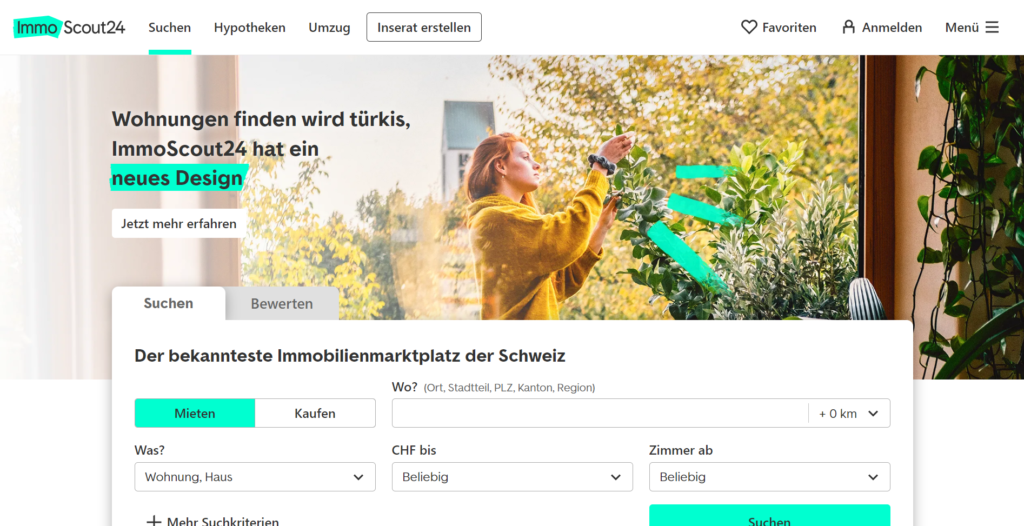
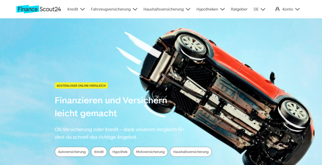
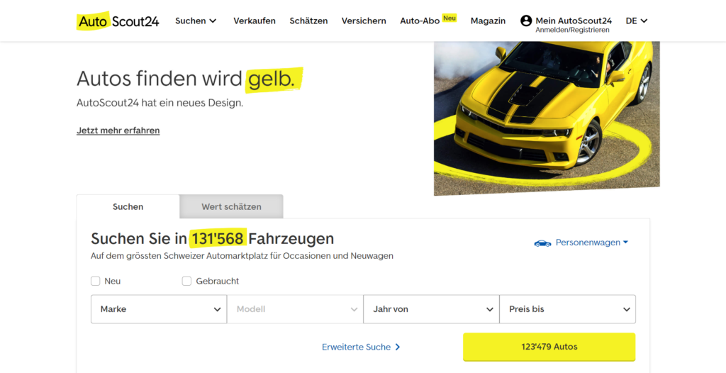
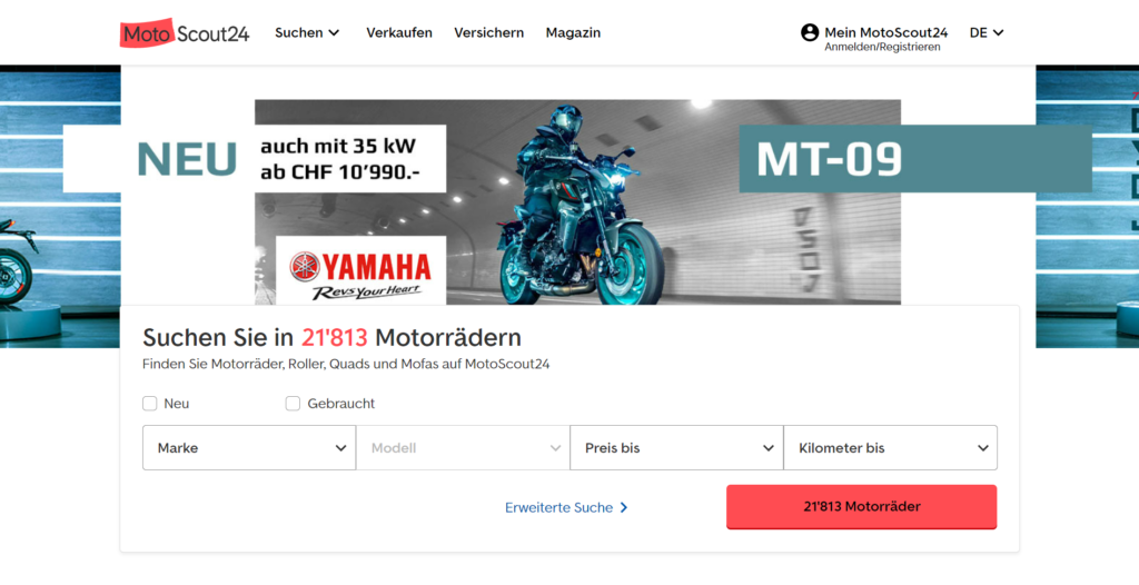
While creating a strong brand presence, this approach resulted in insufficient distinctiveness among individual platforms. The logos were consistently orange and blue across the board. Although this made for a very strong overall brand presence, it gave the individual platforms too little in way of uniqueness. Certainly, it was time to add more colour to the platforms. Each platform was assigned the colour of a highlighter pen in order to create a distinct and bright brand image. Additionally to highlight important messages and features we want our users to know about.
Rebranding: New Design - Same Goal
A significant alteration in a familiar platform’s visual appearance can lead to user and business customer confusion and uncertainty. Therefore, the teams thought it was important to start communicating the rebranding whilst also reassuring the platforms’ end-users that each platform’s services would remain the same. If anything, a cleaner and more modern design would improve the user experience. Subsequently streamlining the user journey and making information more easily accessible
A True Team Effort
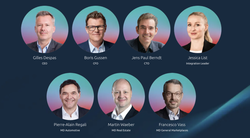
It goes without saying that in order to complete such a large-scale project, you need to have all hands on deck. From strategy and branding to the designers, to the product & UX team and engineers, to marketing and communications. Everyone was involved in making this comprehensive rebranding a success. And so it was. You can break down the entire process into different phases. The 1. July was the last one, when we officially unveiled the design and marketing campaigns. To illustrate the order in which we tackled such an extensive creative project, we defined four separate phases:
- Adaption of logos, fonts, colours
- Adaption of icons & illustrations
- Implementation of onsite activities & quality assurance
- Go-Live
The coordination efforts have paid off. Each Scout24 platform now has its own distinct look and feel. A consistent, modern, bright colour scheme, unmistakable branding elements, and visual language. These all work together now, makeing it much easier to distinguish between the individual platforms. This results in a better user journey for end users.
Rebranding, now what?
With this article, we wanted to give an initial overview of the project, who was involved, how long it took and what the outcome was to celebrate the great work of our colleagues at SMG. As mentioned at the beginning, two more articles will follow in which we will look into the creative process, how the visual and tonal execution of the rebranding was adapted for the Swiss market, as well as the strategy behind the roll-out and the marketing campaign.