This is the third part in a series. Find the other parts here:
When you think of a rebranding campaign you often associate the whole process with creative elements and a new look (which we focused on in our previous rebranding article). However, a crucial part of any change is how it’s managed and communicated. Scout24 brands are all well-established brands that have had the same look for twenty-plus years. Therefore, changing this look overnight had to be accompanied with relevant and reassuring messaging to ensure customers, users, or brand partners didn’t mistake the new look for a scam, could still find relevant information, and overall got a fresh feel for the brand and associated the new look with the same quality values.
In this third and final part of our rebranding trilogy, we want to talk about the campaigns set up for this rebranding.
B2? - Differentiating target groups for each campaign
It’s important to know who you are addressing when creating any type of communication or campaign. We knew that informing our business customers about this change had to happen sometime before the change. That’s why we decided to approach them approximately six weeks before the Go-Live date. In a three-stage email campaign, our business customers were informed about the benefits of the rebranding, the planned advertising campaigns, and the concept for an informational B2B landing page for each platform that showed process updates in sync with the email campaign. In addition to the digital information, each business partner could order a goodie bag with merchandise in the new design. This would ensure that each business partner was familiar with the new look and had time to inform other relevant parties about it. Meanwhile, the B2C teams started to focus on the users’ change management.
How to inform our customers?
- “Drive what you want” for AutoScout24.
- “Live (as in home living) as you want” for ImmoScout24.
- “Insure as you want” for FinanceScout24.
- “As free as you want” for MotoScout24.
Campaign on Brand Level
This level had one purpose: to get users familiar with the new design. The above-mentioned guiding ideas were used to give each brand a specific message in addition to the new colours allocated to each brand. Users could get used to the new font, new images and a generally fresher appearance without being unduly alienated from the brands.
Campaign on Vertical Level
By vertical level, we mean each business area that our platforms represent, such as automotive, real estate, and finance and insurance.
Each brand took up some specific characteristics from their platforms. For example:
- For AutoScout24, it was new cars, e-cars, family cars, etc.
- For ImmoScout24, it was green living, urban living, etc.
- For FinanceScout24, we focussed on car insurance.
- For MotoScout24, the focus was on freedom.
Campaign on Product Level
Had any product or feature updates been planned, the rebranding would have played a significant role in their communications.
These three levels were implemented in different “flights”.
Warm Up
- The new branding was launched, and so were the ad campaigns.
- The flight lasted for two weeks.
- The campaign was put on hold until the main flight because Switzerland’s summer holiday period had started.
Main Flight
- Started after the Swiss summer holiday period ended.
- This flight also lasted for two weeks.
Reminder Flight
- This last flight was used to ensure “every” user had seen the new design and ads.
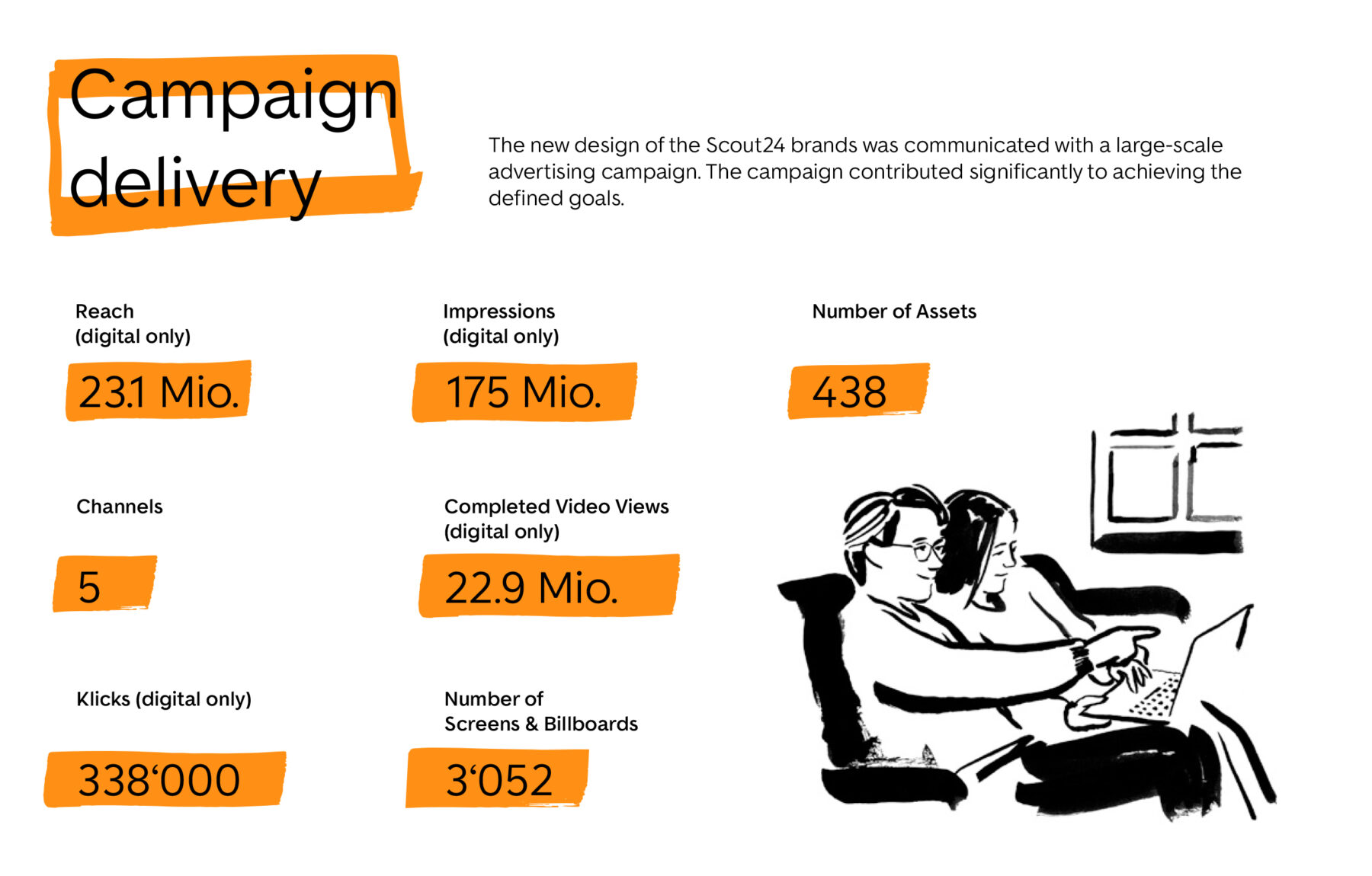
The campaigns were primarily launched online, with a variety of video material as well as display ads. Some (D)OOH ads, TV sponsoring and other special placements were also implemented.
With all of these initiatives, user and customer confusion was very low. The rebranding was communicated on as many different channels as possible to ensure it reached the largest user base possible.
So, did everything go as planned?
Learnings
On the product side, everything worked out really well. The product teams made sure that landing pages were ready, and aside from some deadline pressure, everything was ready to go live on the first of July without any major issues. However, if you ever find yourself in the midst of a big rebranding project, make sure you plan enough time for the process. Whatever timeline you have, try to add a few more days (or weeks, if possible) and involve all the stakeholders as early as possible: feedback loops will be less hectic, and ownership of specific tasks is better ensured.
But most importantly: communication is key. Not only to your users, customers, and partners but also between teams. On a project this big, if everything is communicated well, it might be all plain sailing!
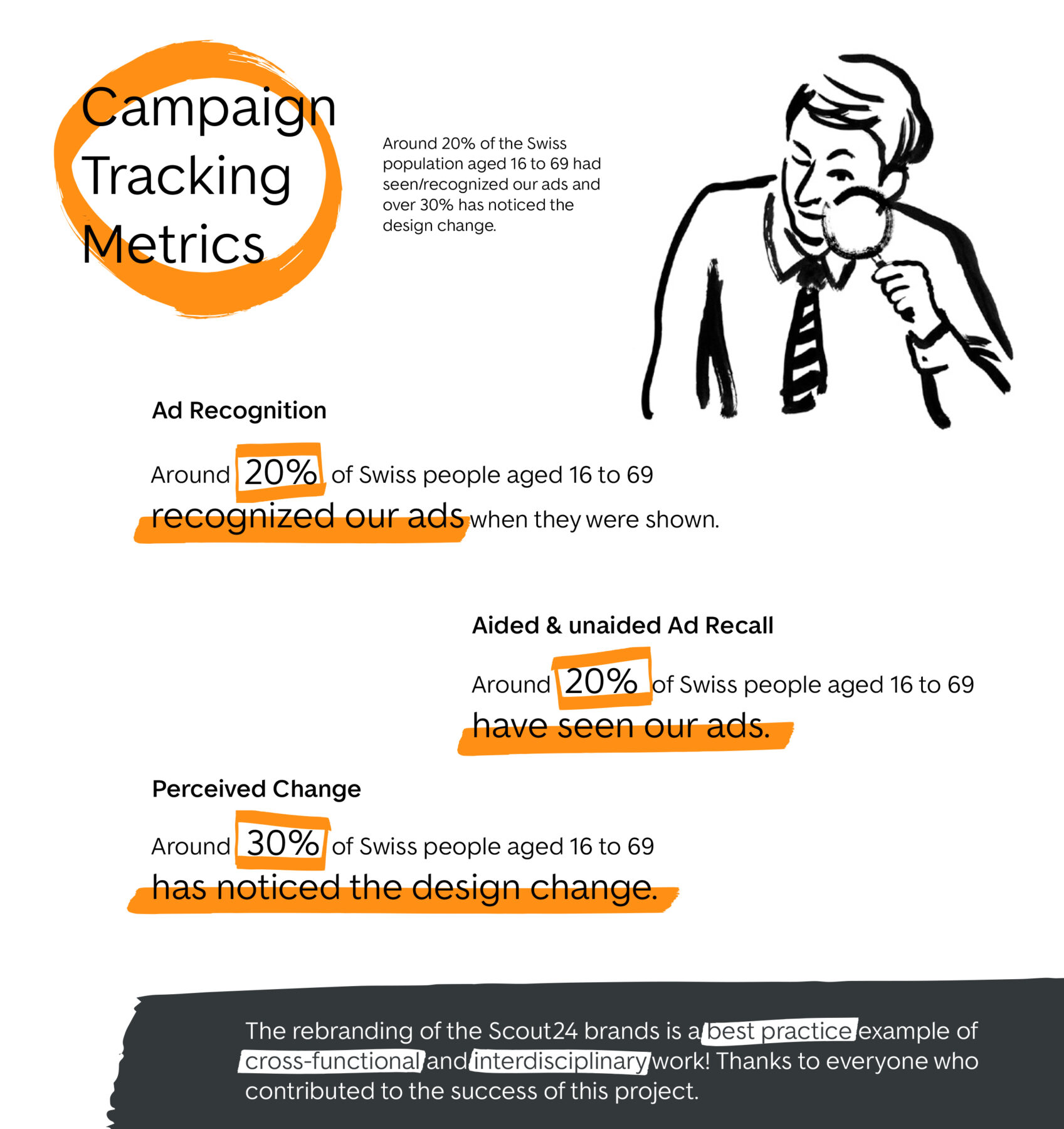
First Results (Updated: 16.01.2023)